How to create Chrome-Style Tabs Using CSS
In this article, we will explore a step-by-step guide on how to create Chrome-style tabs using CSS, allowing you to elevate your web design skills and deliver a seamless browsing experience for your users.
How can this be achieved? The following section will present two approaches.
Pseudo-element
One possible approach to consider is utilizing two pseudo-elements for concatenation.
<nav class="tab">
  <a class="tab-item">Svelte API</a>
  <a class="tab-item active">Svelte API</a>
  <a class="tab-item">Svelte API</a>
  <a class="tab-item">Svelte API</a>
</nav>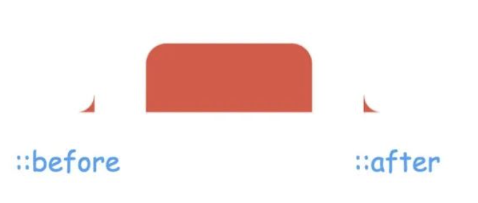
In order to achieve reverse rounded corners on the left and right sides, one can consider utilizing styles that enable the creation of circular shapes. One such style is the “border-radius” property. The following steps can be taken to implement this approach:
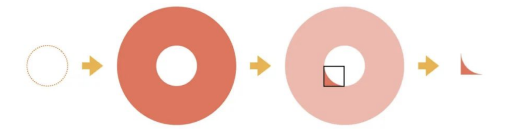
1. Draw a transparent circle.
2. Apply a sufficiently large border or shadow to the circle.
3. Clip a small portion of the circle.
.tab-item{
position: relative;
background-color: red;
padding: 10px 15px;
border-radius: 12px 12px 0 0;
cursor: pointer;
transition: .2s;
}
.tab-item::before,.tab-item::after{
position: absolute;
bottom: 0;
content: '';
width: 20px;
height: 20px;
border-radius: 100%;
box-shadow: 0 0 0 40px red;
transition: .2s;
}
.tab-item::before{
left: -20px;
clip-path: inset(50% -10px 0 50%);
}
.tab-item::after{
right: -20px;
clip-path: inset(50% 50% 0 -10px);
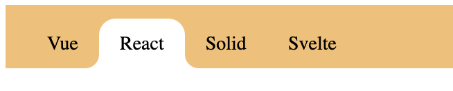
}The final outcome is depicted as follows:
The aforementioned cropping is achieved using the clip-path property. It is important to note that additional inward cropping on the left and right sides is recommended to prevent any gaps in the resulting composition.
Full code:
<nav class="tab">
  <a class="tab-item">Vue</a>
  <a class="tab-item active">React</a>
  <a class="tab-item">Solid</a>
  <a class="tab-item">Svelte</a>
</nav>.tab{
display: flex;
background-color: #f6bf6f;
padding: 10px 15px 0 15px;
font-size: 14px;
}
.tab-item{
position: relative;
background-color: transparent;
padding: 10px 15px;
border-radius: 12px 12px 0 0;
cursor: pointer;
transition: .2s;
}
.tab-item::before,.tab-item::after{
position: absolute;
bottom: 0;
content: '';
width: 20px;
height: 20px;
border-radius: 100%;
box-shadow: 0 0 0 40px transparent;
transition: .2s;
}
.tab-item::before{
left: -20px;
clip-path: inset(50% -10px 0 50%);
}
.tab-item::after{
right: -20px;
clip-path: inset(50% 50% 0 -10px);
}
.tab-item:hover{
background-color: #F2D0CA;
/* color: #000; */
}
.tab-item:hover::before,
.tab-item:hover::after{
box-shadow: 0 0 0 30px #F2D0CA;
}
.tab-item.active{
background-color: #fff;
z-index: 1;
/* color: #000; */
}
.tab-item.active::before,
.tab-item.active::after{
box-shadow: 0 0 0 30px #fff;
}Gradients
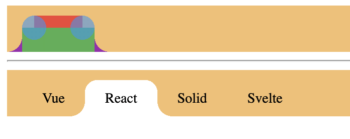
CSS gradients are incredibly versatile and can be used to create a wide range of graphical elements. In this case, the design consists of two rectangles, two circles, and two inverted rounded corners. This is achieved through the use of 2 linear gradients and 4 radial gradients.
The layout is illustrated as follows:
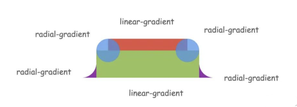
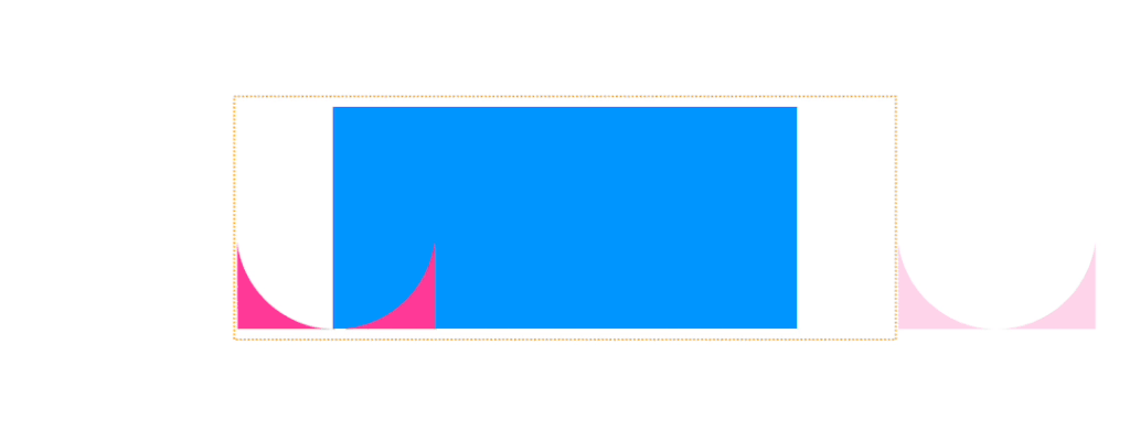
Two reverse-rounded corners can be achieved using 2 radial gradients:
The full code is as follows:
<nav class="tab">
  <a class="tab-item">React</a>
</nav>
<hr>
<nav class="tab fix">
  <a class="tab-item">Vue</a>
  <a class="tab-item active">React</a>
  <a class="tab-item">Solid</a>
  <a class="tab-item">Svelte</a>
</nav>.tab{
display: flex;
background-color: #f6bf6f;
padding: 10px 15px 0 15px;
font-size: 14px;
}
.tab-item{
position: relative;
padding: 10px 35px;
cursor: pointer;
margin: 0 -15px;
color: transparent;
background-image:
radial-gradient(circle at 27px 12px, var(--color,rgba(33,150,243,.59)) 12px,transparent 0),
linear-gradient(var(--color,#4caf50),var(--color,#4caf50)),
linear-gradient(var(--color,#F44336),var(--color,#F44336)),
radial-gradient(circle at 15px 0, transparent 15px,var(--color, #9C27B0) 0);
background-size:calc(100% - 54px), calc(100% - 30px) calc(100% - 12px), calc(100% - 54px) 100%, 100% 15px;
background-position:left top, center bottom, center bottom, -15px bottom;
background-repeat: repeat-x, no-repeat, no-repeat, repeat-x;
}
.tab.fix .tab-item{
--color: transparent;
color: #000;
}
.tab.fix .tab-item:hover{
--color: #F2D0CA;
}
.tab.fix .tab-item.active{
--color: #fff;
z-index: 1;
/* color: #000; */
}The final result is as follows: