Get started with CSS Scroll-driven Animations
In the latest version of Chrome 115, the highly anticipated CSS Scroll-driven animations are now officially supported. With this feature, almost any interaction that previously required JavaScript to listen for scrolling can now be achieved purely with CSS.
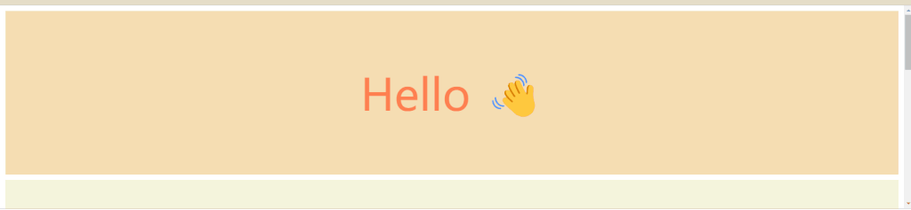
Introduction to APIs may not be very interesting, so let’s first get a sense of it through a straightforward example. Below is a page progress indicator that changes as the page is scrolled.
Full code:
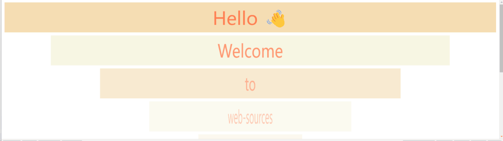
<div>Hello 👋</div>
<div>Welcome</div>
<div>to</div>
<div>web-sources</div>
<a class="back" href="#"></a>html,
body {
scroll-behavior: smooth;
}
body {
margin: 0;
}
body::after {
content: "";
position: fixed;
top: 0;
left: 0;
right: 0;
height: 10px;
background-color: #f44336;
transform-origin: 0 50%;
animation: grow-progress 1s linear;
animation-timeline: scroll();
}
main {
padding: 10px;
}
div {
display: flex;
align-items: center;
justify-content: center;
height: 300px;
margin: 10px;
background-color: beige;
color: coral;
font-size: 80px;
}
div:nth-child(odd) {
background-color: wheat;
}
.back {
position: fixed;
right: 10px;
bottom: 10px;
background-color: royalblue;
border-radius: 4px;
width: 40px;
height: 40px;
animation: back-progress 1s linear forwards;
animation-timeline: scroll();
animation-range: entry 0 100px;
}
@keyframes grow-progress {
from {
transform: scaleX(0);
}
to {
transform: scaleX(1);
}
}
@keyframes back-progress {
from {
transform: translateY(150%);
}
to {
transform: translateY(0%);
}
}
Isn’t it very simple? If you’re interested, you can continue reading below.
CSS Scroll-driven Animations
It is well-known that traditional JS scroll event listeners have some issues, as follows:
- Modern browsers execute scrolling on separate processes, resulting in the asynchronous transmission of scroll events.
- Due to the asynchronous nature of the transmission, main thread animations are prone to stuttering.
Therefore, in order to address the problem of scroll stuttering, CSS scroll-driven animations have emerged. So, what exactly is CSS scroll-driven animation?
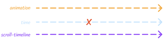
By default, animations play as time passes.
“CSS scroll-driven animations” refer to the takeover of the animation execution process by the page scroll. In this scenario, the animation only changes in accordance with the changes in page scroll, meaning that it executes in proportion to the amount of scrolling, rendering time irrelevant.
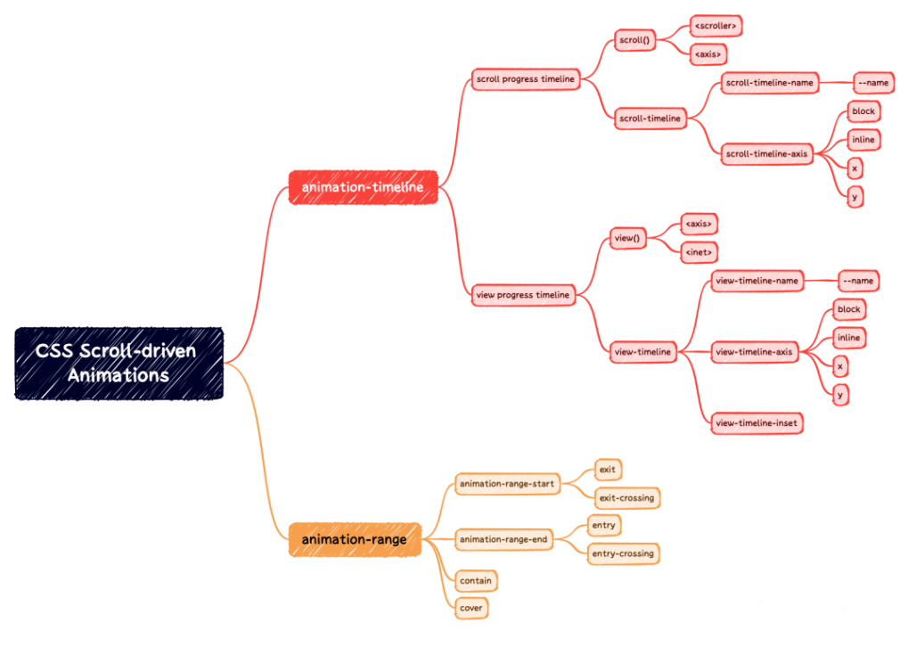
In order to modify the timeline of an animation, the animation-timeline is necessary. This API also referred to as the animation timeline or time axis, is an essential attribute used to control the progression of CSS animations.
Syntax
/* Keyword */
animation-timeline: none;
animation-timeline: auto; /* default */

/* Single animation named timeline */
animation-timeline: --timeline_name;

/* Single animation anonymous scroll progress timeline */
animation-timeline: scroll();
animation-timeline: scroll(scroller axis);

/* Single animation anonymous view progress timeline */
animation-timeline: view();
animation-timeline: view(axis inset);
Is it a bit confusing? Don’t worry, there are countless scrolling scenarios, and they can be broadly categorized into two types:
- the scroll progress timeline, represented by the keyword scroll()
- the view progress timeline, represented by the keyword view(). These two forms correspond to different application scenarios.
What does this mean? Let’s explain each one below.
Scroll progress timeline
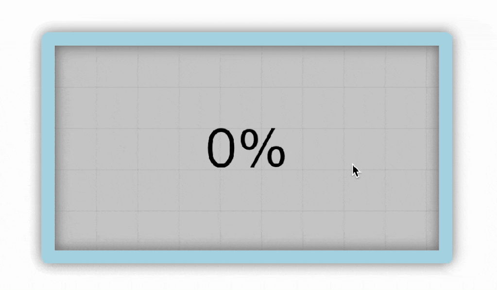
Mapping scroll progress to animation progress: The initial scroll position represents 0% progress, while the final scroll position represents 100% progress. Below is a visual demonstration:
https://scroll-driven-animations.style/tools/scroll-timeline/progress/
In the first example of the progress bar, we utilized the scroll progress timeline, as we were monitoring the scrolling of the webpage.
animation-timeline: scroll([scroller] [axis]);scroller (optional)
The value for indicating the scroller element that will provide the scroll progress timeline can be any one of the following:
nearest– The nearest ancestor of the current element that has scrollbars on either axis. This is the default value.root– The root element of the document.self– The current element itself.
axis (optional)
The scrollbar axis value can be any one of the following:
block– The scrollbar on the block axis of the scroll container, which is the axis in the direction perpendicular to the flow of text within a line. This is the default value.inline– The scrollbar on the inline axis of the scroll container, which is the axis in the direction parallel to the flow of text in a line.y– The scrollbar on the vertical axis of the scroll container.x– The scrollbar on the horizontal axis of the scroll container.
/* Function with no parameters set */
animation-timeline: scroll();

/* Values for selecting the scroller element */
animation-timeline: scroll(nearest); /* Default */
animation-timeline: scroll(root);
animation-timeline: scroll(self);

/* Values for selecting the axis */
animation-timeline: scroll(block); /* Default */
animation-timeline: scroll(inline);
animation-timeline: scroll(y);
animation-timeline: scroll(x);

/* Examples that specify scroller and axis */
animation-timeline: scroll(block nearest); /* Default */
animation-timeline: scroll(inline root);
animation-timeline: scroll(x self);
Sometimes, when the DOM structure is slightly more complex, automatic searching is not applicable. Additionally, the nearest ancestor scroll container is also affected by absolute positioning, so we need to manually specify the scroll container.
scroll-timeline-name is set on the scroller that will provide the timeline. Its values must start with --, which helps avoid name clashes with standard CSS keywords.
The name is then referenced in an animation-timeline declaration to indicate the container’s element that is used to drive the progress of the animation through the scrolling action.
.scroller {
  scroll-timeline-name: --my-scroller;
  scroll-timeline-axis: inline;
}

.scroller .subject {
  animation: animate-it linear;
  animation-timeline: --my-scroller;
}
The scroll-timeline-axis and scroll-timeline-name properties can also be set using the scroll-timeline shorthand property.
scroll-timeline-name: --my-scroller;
scroll-timeline-axis: inline;
/**可简写为**/
scroll-timeline: --my-scroller inline;
Example:
Full code:
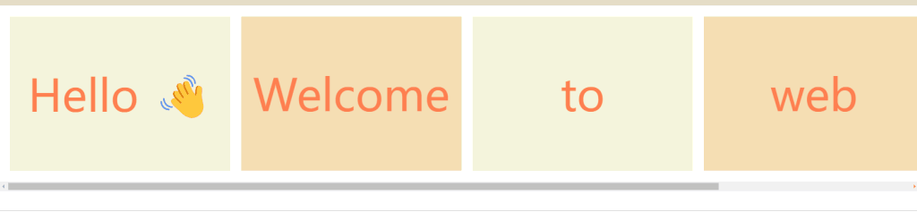
<main>
    <span></span>
    <div>Hello 👋</div>
    <div>Welcome</div>
    <div>to</div>
    <div>web</div>
    <div>sources</div>
</main>body{
margin: 0;
}
/* scroll container */
main{
display: flex;
overflow-x: scroll;
scroll-timeline: --scrollcontainer inline;
}
main>span{
position: fixed;
top: 0;
left: 0;
right: 0;
height: 10px;
background-color: #F44336;
transform-origin: 0 50%;
animation: auto grow-progress linear forwards;
animation-timeline: --scrollcontainer;
}
main{
padding: 10px;
}
div{
display: flex;
align-items: center;
justify-content: center;
width: 300px;
height: 280px;
flex-shrink: 0;
margin: 10px;
background-color: beige;
color: coral;
font-size: 80px;
}
div:nth-child(odd){
background-color: wheat;
}
@keyframes grow-progress {
from { transform: scaleX(0); }
to { transform: scaleX(1); }
}View progress timeline
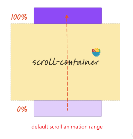
“It represents the progress of an element appearing within the viewport of a webpage, focusing on the element’s own position. The progress starts at 0% when the element is just about to appear and reaches 100% when the element is completely out of view. Below is a visual demonstration:
https://scroll-driven-animations.style/tools/view-timeline/progress/
This concept bears a strong resemblance to the Intersection Observer API in JavaScript, which enables the detection of elements within the visible area.
animation-timeline: view([axis] [inset]);

/* Function with no parameters set */
animation-timeline: view();

/* Values for selecting the axis */
animation-timeline: view(block); /* Default */
animation-timeline: view(inline);
animation-timeline: view(y);
animation-timeline: view(x);

/* Values for the inset */
animation-timeline: view(auto); /* Default */
animation-timeline: view(20%);
animation-timeline: view(200px);
animation-timeline: view(20% 40%);
animation-timeline: view(20% 200px);
animation-timeline: view(100px 200px);
animation-timeline: view(auto 200px);

/* Examples that specify axis and inset */
animation-timeline: view(block auto); /* Default */
animation-timeline: view(inline 20%);
animation-timeline: view(x 200px auto);
axis (optional)
The scrollbar axis value can be any one of the following:
block– The scrollbar on the block axis of the scroll container, which is the axis in the direction perpendicular to the flow of text within a line. This is the default value.
inline– The scrollbar on the inline axis of the scroll container, which is the axis in the direction parallel to the flow of text in a line.
y– The scrollbar on the vertical axis of the scroll container.
x– The scrollbar on the horizontal axis of the scroll container.
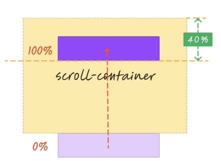
inset (optional)
The inset value can be one or two values, which can be either auto or a <length-percentage>. It specifies an inset (positive) or outset (negative) adjustment of the scrollport.
start– Inward offset from beginning of the scrollport.
end– Inward offset from end of the scrollport.
For example, setting it to 40% means adjusting the viewport range, which is equivalent to reducing the top margin of the scroll container by 40%. When scrolling reaches the top 40% of the viewport, the animation is considered complete.
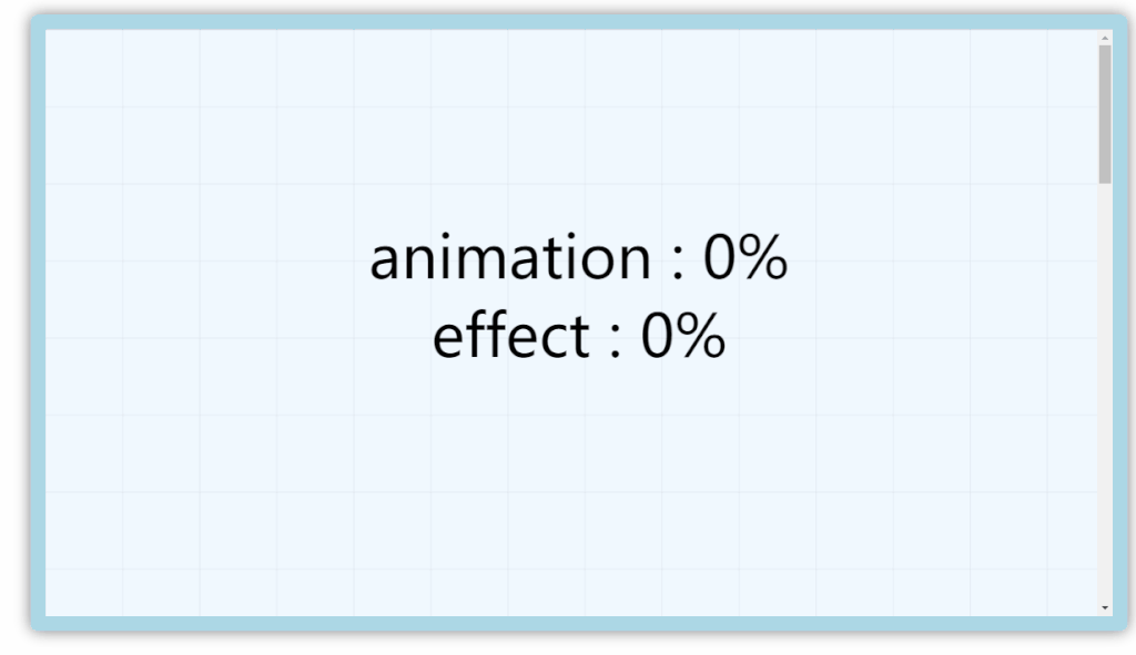
Full code:
<div>Hello 👋</div>
<div>Welcome</div>
<div>to</div>
<div>web-sources</div>
<div>Hello 👋</div>
<div>Welcome</div>
<div>to</div>
<div>web-sources</div>body{
margin: 0;
}
main{
padding: 10px;
}
div{
display: flex;
align-items: center;
justify-content: center;
height: 100px;
margin: 10px;
background-color: beige;
color: coral;
font-size: 60px;
animation: appear 1s linear both;
animation-timeline: view(block 25% -100px);
}
div:nth-child(odd){
background-color: wheat;
}
@keyframes appear {
from {
opacity: 0;
transform: scaleX(0);
}
100% {
opacity: 1;
transform: scaleX(1);
}
}animation-range
By default, the animation progress is mapped one-to-one with the scrolling range. However, there are instances where a complete range is not necessary.
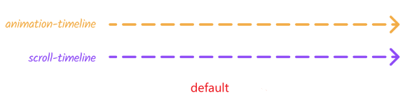
The animation-range shorthand property can be applied to a container element as a combination of the <animation-range-start> and <animation-range-end> values. If both the values are specified, they will be interpreted in the order <animation-range-start> then <animation-range-end>.
/* single keyword or length percentage value */
animation-range: normal; /* Equivalent to normal normal */
animation-range: 20%; /* Equivalent to 20% normal */
animation-range: 100px; /* Equivalent to 100px normal */

/* single named timeline range value */
animation-range: cover; /* Equivalent to cover 0% cover 100% */
animation-range: contain; /* Equivalent to contain 0% contain 100% */
animation-range: cover 20%; /* Equivalent to cover 20% cover 100% */
animation-range: contain 100px; /* Equivalent to contain 100px cover 100% */

/* two values for range start and end */
animation-range: normal 25%;
animation-range: 25% normal;
animation-range: 25% 50%;
animation-range: entry exit; /* Equivalent to entry 0% exit 100% */
animation-range: cover cover 200px; /* Equivalent to cover 0% cover 200px */
animation-range: entry 10% exit; /* Equivalent to entry 10% exit 100% */
animation-range: 10% exit 90%;
animation-range: entry 10% 90%;
scroll progress
animation-range: normal; /* Equivalent to normal normal */
animation-range: 20%; /* Equivalent to 20% normal */
animation-range: 100px; /* Equivalent to 100px normal */
Full code
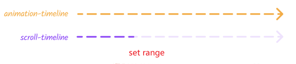
<header>😀</header>
<div>Hello 👋</div>
<div>Welcome</div>
<div>to</div>
<div>web-sources</div>body{
margin: 0;
padding-top: 100vh;
}
header{
position: fixed;
top: 0;
width: 100%;
display: flex;
background-color: royalblue;
height: 100vh;
align-items: center;
justify-content: center;
font-size: 100px;
color: #fff;
animation: header 1s linear forwards;
animation-timeline: scroll();
animation-range: 0 calc(100vh - 60px);
}
main{
padding: 10px;
}
div{
display: flex;
align-items: center;
justify-content: center;
height: 300px;
margin: 10px;
background-color: beige;
color: coral;
font-size: 80px;
}
div:nth-child(odd){
background-color:wheat
}
@keyframes header {
to {
height: 60px;
font-size: 30px;
}
}view process
/* single named timeline range value */
animation-range: cover; /* Equivalent to cover 0% cover 100% */
animation-range: contain; /* Equivalent to contain 0% contain 100% */
animation-range: cover 20%; /* Equivalent to cover 20% cover 100% */
animation-range: contain 100px; /* Equivalent to contain 100px cover 100% */
/* two values for range start and end */
animation-range: normal 25%;
animation-range: 25% normal;
animation-range: 25% 50%;
animation-range: entry exit; /* Equivalent to entry 0% exit 100% */
animation-range: cover cover 200px; /* Equivalent to cover 0% cover 200px */
animation-range: entry 10% exit; /* Equivalent to entry 10% exit 100% */
animation-range: 10% exit 90%;
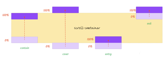
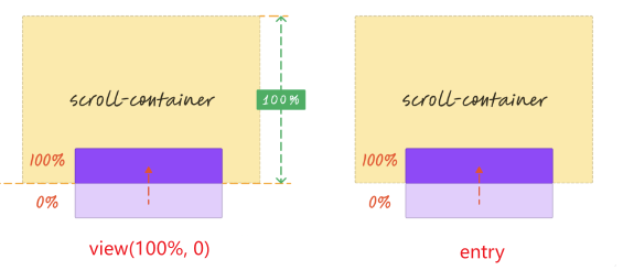
animation-range: entry 10% 90%;cover: the process in which an element first enters the visible range of a scrolling container (0%) and continues until it is completely out of view (100%). In other words, the element only needs to have some intersection with the visible range (default behavior).contain: the element must be fully within the visible range of the scrolling container (0%) and is about to leave (100%) in order for it to trigger an event. In this case, the element must be entirely visible.entry: the process in which an element enters the visible range of the scrolling container. The visibility starts at 0% when the element has just entered and reaches 100% when it is fully within the visible range. In other words, it only takes effect during the entry process.exit: the process in which an element leaves the visible range of the scrolling container. The visibility starts at 0% when the element has just left and reaches 100% when it is completely out of view. In other words, it only takes effect during the exit process.entry-crossingis similar toentry, and no significant differences have been observed at this time.exit-crossingis similar toexit, and no significant differences have been observed at this time.
One can utilize the following tool to compare the respective differences.
https://scroll-driven-animations.style/tools/view-timeline/progress
The effect achieved by view(100% 0) is actually the same as the effect of entry.
In addition, it is also possible to simultaneously set up both entrance and exit animations, which requires defining two animations and assigning animation intervals to each. The crucial code for this is as follows:
div{
  animation: appear 1s linear forwards,
             disappear 1s linear forwards;
  animation-timeline: view();
  animation-range: entry,exit; /* entry: appear,exit: disappear*/
}

@keyframes appear {
  0% {
    opacity: 0;
    transform: scaleX(0);
  }

  100% {
    opacity: 1;
    transform: scaleX(1);
  }
}

@keyframes disappear {
  100% {
    opacity: 0;
    transform: scaleX(0);
  }

  0% {
    opacity: 1;
    transform: scaleX(1);
  }
}
Additionally, the animation-range can be consolidated into a single animation by adding the keywords “entry” and “exit” before the keyframes. This eliminates the need to specify the animation-range.
div{
  animation: animate-in-and-out 1s linear forwards;
  animation-timeline: view();
}

@keyframes animate-in-and-out {
  entry 0% {
    opacity: 0;
    transform: scaleX(0);
  }

  entry 100% {
    opacity: 1;
    transform: scaleX(1);
  }
  exit 100% {
    opacity: 0;
    transform: scaleX(0);
  }

  exit 0% {
    opacity: 1;
    transform: scaleX(1);
  }
}
More interesting examples
https://scroll-driven-animations.style/
Conclusion