10 Examples of Conic Gradients
With CSS conic-gradient, you can now effortlessly design stunning circular color gradients that span 360 degrees, allowing for seamless transitions and captivating visual effects. Whether you want to create dynamic backgrounds, circular progress bars, or eye-catching radial patterns, conic-gradient opens up a world of possibilities for web designers and developers. In this article, we will present 10 examples of conic gradients.
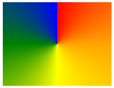
div {
  background: conic-gradient(red, orange, yellow, green, blue);
}
In this manner, a conical radiating pattern can be obtained.
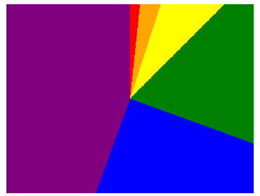
Pie chart:
div {
  background: conic-gradient(
     red 6deg, orange 6deg 18deg, yellow 18deg 45deg,
     green 45deg 110deg, blue 110deg 200deg, purple 200deg);
}
In addition to the aforementioned, what other patterns can be depicted? The following section will present several practical examples.
Triangle
Before the emergence of conical gradients, linear gradients could also be used to create triangles, but only right-angled triangles could be drawn, for example.
div {
  background: linear-gradient( -45deg, royalblue 50%, transparent 0);
}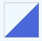
If you want to draw a triangle like this
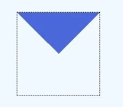
div {
  background: conic-gradient( from -45deg, royalblue 90deg, transparent -45deg);
}
Arrow
div {
  height: 60px;
  background: conic-gradient(from 30deg, royalblue 120deg, transparent 0deg);
  background-size: 40px 60px;
  background-repeat: no-repeat;
}
Creating an inverted hollow triangle:
div {
  height: 60px;
  background: conic-gradient(from 30deg at 0 50%, transparent 120deg, royalblue 0deg);
  background-size: 40px 60px;
  background-repeat: no-repeat;
}
Combining both backgrounds together
div {
  height: 60px;
	background: conic-gradient(from 30deg, royalblue 120deg, transparent 0deg), conic-gradient(from 30deg at 0 50%, transparent 120deg, royalblue 0deg);
  background-size: 40px 60px;
  background-repeat: no-repeat;
}
Next, interchange the positions of the two entities and arrange them horizontally in a tiled manner.
div {
  height: 60px;
	background: conic-gradient(from 30deg, royalblue 120deg, transparent 0deg), conic-gradient(from 30deg at 0 50%, transparent 120deg, royalblue 0deg);
  background-size: 40px 60px;
  background-repeat: repeat-x;
	background-position: -20px 0%, 20px 0%;
}
River

On the aforementioned basis, the vertical direction is also configured to “repeat” and the vertical dimensions are adjusted.
div {
  height: 60px;
	background: conic-gradient(from 30deg, royalblue 120deg, transparent 0deg), conic-gradient(from 30deg at 0 50%, transparent 120deg, royalblue 0deg);
  background-size: 40px 30px;
  background-repeat: repeat;
	background-position: -20px 0%, 20px 0%;
}
Corner marker

In the case of a linear gradient, it may require four gradients to be completed, whereas in the case of a conical gradient, only two gradients are sufficient. The following outlines the implementation process:
First, draw a triangle:
div {
  background: conic-gradient( from -45deg, royalblue 90deg, transparent -45deg);
}
By default, the center of the radial gradient is positioned at the center of the canvas, specifically at the coordinates (50%, 50%). However, it is possible to manually specify the position of the center point by utilizing the “at” keyword.
div {
  background: conic-gradient( from -45deg at 10px 10px,  royalblue 90deg, transparent 0deg);
}
Next, set the horizontal direction to repeat” and shift the position of the entire background image 10 pixels to the left.
div {
	height: 100px;
	background: conic-gradient( from -45deg at 10px 10px,  royalblue 90deg, transparent 0deg);
	background-repeat: repeat-x;
  background-position: -10px 0;
}
Next, using the same method, draw the two subscripts below. The complete code is as follows:
div {
	height: 60px;
	background: conic-gradient( from -45deg at 10px 10px,  royalblue 90deg, transparent 0deg),
    conic-gradient( from 135deg at left 10px bottom 10px,  royalblue 90deg, transparent 0deg);
	background-repeat: repeat-x;
  background-position: -10px 0;
}
Rectangle & Square
div {
	width: 60px;
	height: 60px;
	background: conic-gradient(  royalblue 90deg, transparent 0deg);
}
One can also create rectangles of varying positions and sizes by altering the center point and starting angle.
div {
	width: 60px;
	height: 60px;
	background: conic-gradient(from 0deg at 20px 30px, royalblue 90deg, transparent 0deg);
	border: 1px dotted #000;
	background-position: -10px 0;
	background-repeat: no-repeat;
}
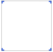
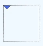
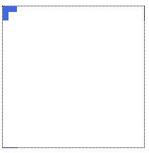
Square corner mark
First, draw a square in the upper left corner:
div {
	width: 60px;
	height: 60px;
	border: 1px dotted #000;
	background: conic-gradient( from -90deg at 20px 20px, royalblue 90deg, transparent 0deg);
}
Next, modify the size of the background.
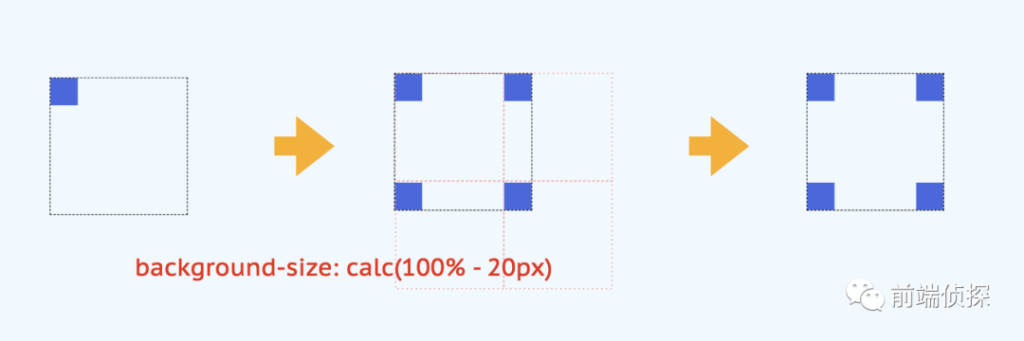
div {
	width: 60px;
	height: 60px;
	border: 1px dotted #000;
	background: conic-gradient( from -90deg at 20px 20px, royalblue 90deg, transparent 0deg);
  background-size: calc(100% - 20px) calc(100% - 20px);
  background-repeat: repeat;
}
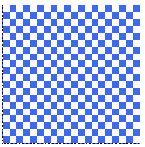
Checkerboard
div {
	width: 200px;
	height: 200px;
	border: 1px dotted #000;
	background: conic-gradient(  royalblue 90deg, transparent 0deg 180deg, royalblue 180deg 270deg, transparent 0deg);
  background-size: 20px 20px;
	background-repeat: repeat;
}
Dotted grid
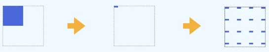
div {
	width: 200px;
	height: 200px;
	border: 1px dotted #000;
	background: conic-gradient( from -90deg at 10px 4px,  royalblue 90deg, transparent 0deg);
  background-size: 30px 30px;
	background-repeat: repeat;
}
Cross-line grid
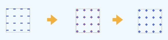
div {
	width: 200px;
	height: 200px;
	border: 1px dotted #000;
	background: conic-gradient( from -90deg at 10px 4px,  royalblue 90deg, transparent 0deg),
      conic-gradient( from -90deg at 4px 10px,  royalblue 90deg, transparent 0deg);
  background-size: 30px 30px;
  background-position: 0 3px, 3px 0;
	background-repeat: repeat;
}
Line angle marker
div {
	width: 200px;
	height: 200px;
	border: 1px dotted #000;
	background: conic-gradient( from -90deg at 20px 8px,  royalblue 90deg, transparent 0deg), conic-gradient( from -90deg at 8px 20px,  royalblue 90deg, transparent 0deg);
}
div {
	width: 200px;
	height: 200px;
	border: 1px dotted #000;
	background: conic-gradient( from -90deg at 20px 8px,  royalblue 90deg, transparent 0deg), conic-gradient( from -90deg at 8px 20px,  royalblue 90deg, transparent 0deg);
	background-position: -10px -4px, -4px -10px;
	background-repeat: repeat;
}