How to Convert CSS Units to Numeric Values
In CSS, font sizes are typically defined using various units such as pixels (px), ems (em), or percentages (%). These units allow for flexible and responsive typography on the web. However, there may be cases where you need to work with font sizes as numeric values rather than units. Understanding how to convert CSS units to numeric values can provide you with greater control and precision over font size manipulation.
For example, in mobile development, it is common to set the root font size in this manner:
:root{
  font-size: max(12px, min( 12px + (100vw - 320px) / 55 * 4, 20px ));
}
p{
  font-size: 2rem;
}
In this case, what should be the actual value of <p>? In the past, we could only obtain it through JS, but now, it can also be achieved solely through CSS.
Let us explore this further.
CSS trigonometric functions
In theoretical terms, dividing a length by 1px should yield a specific numerical value, representing the number of divisions of that length by 1px.
2rem / 1pxHowever, it is widely known that the calc function does not allow the use of units in the divisor during division operations. (In the future, it is possible that CSS will provide support for this feature.)
calc(2rem / 1px) /* invalid */However, a turning point has finally arrived. In Chrome 111, CSS has introduced a series of trigonometric functions.
- sin()
- cos()
- tan()
- asin()
- acos()
- atan()
- atan2()
In regards to the “tangent function,” a brief review will be provided here.
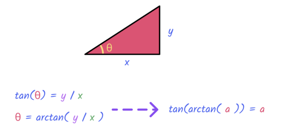
In a right triangle, the ratio of the “opposite side” to the “adjacent side” of one of the acute angles is referred to as the “tangent value” of that angle. The “inverse tangent” is a method used to determine the “radian value” of the angle by reversing the roles of the two legs of the right triangle. This is illustrated as follows:
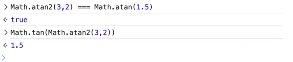
These functions themselves are not particularly special, except for one notable exception, which is atan2. It functions similarly to atan as both are inverse tangent functions. The only difference is that atan2 supports two values.
atan2(y, x)For example:
transform: rotate(atan2(3, 2));
/* Equivalent to */
transform: rotate(atan(1.5));
It may appear to lack significance; why not simply utilize the tangent function directly?
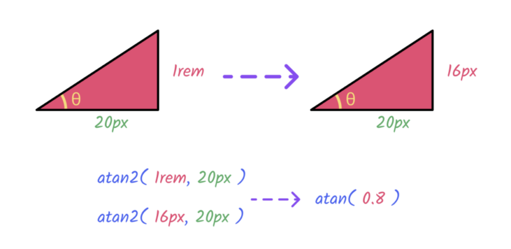
transform: rotate(atan2(3/2));In contrast to JS, CSS also allows for the use of “units”, as demonstrated below.
transform: rotate(atan2(1rem, 20px));If the current value of 1rem is 16px, the browser will compare the actual length of 1rem with 20px, effectively performing a division operation between two units of length.
/* Equivalent to */
transform: rotate(atan(.8)); /* 16px / 20px */
In other words, the value of y/x can provide the true ratio between two CSS lengths without the need for additional conversion.
Next, the values inside the parentheses are parsed using the tangent function, tan.
tan(atan2(1rem, 20px)) /*.8*/This can actually be verified in JavaScript as well, although CSS allows for values with units.
If the value is set to 1px, it is equivalent to dividing any length by 1px, resulting in a value in pixels for any length, as shown below.
tan(atan2(1rem, 1px)) /*16*/With the introduction of this dimensionless absolute value, numerous possibilities arise.
Several examples will be provided below to illustrate its potential applications.
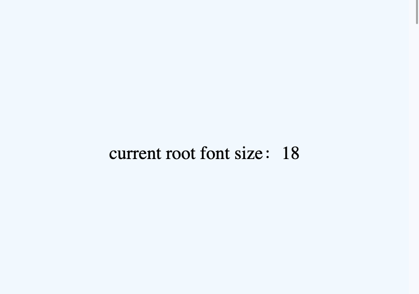
Get current font size
According to the principles discussed in the previous section, it is possible to convert any length into a numerical value by utilizing the functions tan() and atan2().
:root {
  font-size: max(12px, min( 12px + (100vw - 320px) / 55 * 4, 20px ));
}

body {
  --px-font: tan(atan2(1rem, 1px));
}
In this manner, the px-font obtains the actual numerical value in pixels. Furthermore, with the aid of CSS counters, it is possible to render this number onto the page.
body::after{
  counter-reset: font var(--px-font);
  content: "current root font size:" counter(font);
}
In addition, it is necessary to define a CSS variable using the @property notation, specifying its type as a length. Subsequently, the desired value to be computed should be assigned to this variable.
@property --font {
  syntax: "<length>";
  initial-value: 1px;
  inherits: false;
}
:root{
  font-size: max(12px, min( 12px + (100vw - 320px) / 55 * 4, 20px ));
}
body::after{
  --font: 1rem;
  --px-font: tan(atan2(var(--font), 1px));
  counter-reset: font var(--px-font);
  content: "current root font size:" counter(font);
}
Real-time display of container size
In CSS container queries, there are several new units of measurement that have been introduced. This discussion will focus on the following two units.
cqw: 1% of a query container’s widthcqh: 1% of a query container’s height
By employing the aforementioned techniques, it is possible to convert units such as cqw and cqh into specific pixel values.
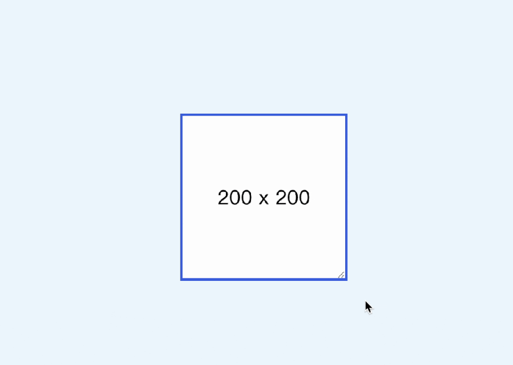
Let us consider the scenario of having a container.
.box {
  display: grid;
  place-content: center;
  width: 200px;
  height: 200px;
  background-color: #fff;
}
In order for the dimensions of the container to take effect, it is necessary to declare the type of container.
.box {
  container-type: size;
}
Next, the same technique is used to render the width and height through counters in a pseudo-element.
<div class="box"></div>

html,body{
  margin: 0;
  height: 100%;
  display: flex;
  justify-content: center;
  flex-direction: column;
  align-items: center;
  background: aliceblue;
}
@property --w {
  syntax: "<length>";
  initial-value: 100px;
  inherits: false;
}
@property --h {
  syntax: "<length>";
  initial-value: 100px;
  inherits: false;
}

.box{
  display: grid;
  place-content: center;
  width: 200px;
  height: 200px;
  background-color: #fff;
  overflow: hidden;
  outline: 3px solid royalblue;
  container-type: size;
  font-size: 24px;
  resize: both;
}
.box::before{
  --w: 100cqw;
  --h: 100cqh;
  --px-width: tan(atan2(var(--w), 1px));
  --px-height: tan(atan2(var(--h), 1px));
  counter-reset: w var(--px-width) h var(--px-height);
  content: counter(w) " x " counter(h);
}
The outcome is as follows, without any JavaScript code present.
Adaptive text avatars
The following example demonstrates an adaptive text avatar that automatically scales to accommodate longer text, ensuring that the entire text is displayed in its entirety.
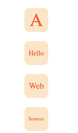
The principle is actually to dynamically set the text size through the mapping relationship of container dimensions. The key implementation is as follows.
.avator-container span {
  font-size: calc( 24px - 10cqw );
}
However, scaling based on text size has a limitation, especially on PCs where there is often a minimum font size restriction (typically 12pt). Therefore, a better approach would be to achieve scaling using the scale property.
Now, with the techniques mentioned above, we can convert the container size into a value recognizable by the scale property. We can determine the scaling ratio by comparing the text width to the container size.
.avator-container span {
  --w: 100cqw;
  --scale: tan(atan2(30px, var(--w)));
  transform: scale(var(--scale));
}
Full code
<div class="avator">
  <div class="avator-inner" alt="A">
    <div class="avator-container">
      <span>A</span>
    </div>
  </div>
</div>
<div class="avator">
  <div class="avator-inner" alt="Hello">
    <div class="avator-container">
      <span>Hello</span>
    </div>
  </div>
</div>
<div class="avator">
  <div class="avator-inner" alt="Web">
    <div class="avator-container">
      <span>Web</span>
    </div>
  </div>
</div>
<div class="avator">
  <div class="avator-inner" alt="Sources">
    <div class="avator-container">
      <span>Sources</span>
    </div>
  </div>
</div>
@property --w {
  syntax: "<length>";
  initial-value: 100px;
  inherits: false;
}
body{
    display: grid;
    place-content: center;
    height: 100vh;
    margin: 0;
    gap: 15px;
}
.avator{
  display: flex;
  align-items: center;
  justify-content: center;
  width: 40px;
  height: 40px;
  font-size: 40px;
  border-radius: 8px;
  background: bisque;
  color: rgb(250, 84, 28);
  white-space: nowrap;
}
.avator-inner{
  position: relative;
}
.avator-inner::before{
  content: attr(alt);
  visibility: hidden;
  padding: 0 .1em;
}
.avator-container {
  position: absolute;
  inset: 0;
  container-type: inline-size;
  text-align: center;
  display: flex;
  justify-content: center;
  align-items: center;
}
.avator-container span {
  --w: 100cqw;
  --scale: tan(atan2(28px, var(--w)));
  transform: scale(var(--scale));
  overflow: hidden;
  text-overflow: ellipsis;
}
Conclusion
- The CSS arctangent function
atan2(y, x)supports two parameters and also accepts CSS units. By applyingtan(atan2(y, x)), we can obtain the ratio of y to x. If x is 1px, we can determine the actual pixel value of y. By utilizing this technique, we can convert values of any type into numerical values. - Pure numerical values can be used in various contexts, such as
scale(var(--n)). If pixel values are needed, you can usecalc(var(--n) * 1px).