Create a Chrome Logo using HTML and CSS
Here’s an example introduction that includes how to create a Chrome logo using HTML and CSS.
Decomposition of Graphs
The chrome logo can be deconstructed into several distinct graphical elements, as illustrated below.

radial-gradient
The central circle exhibits a gradient transition from blue to white, followed by a transparent hue, and is further complemented by an underlying orange color.
<chrome></chrome>chrome{
background: radial-gradient( closest-side circle, #477EE6 calc(100% - 10px), #fff 0 100%, transparent 0) center/90px no-repeat #F2C146;
}This outcome can be achieved:

In this context, the term “closest-side” is employed to refer to the nearest edge. The default value is “farthest-side”. Further options are elaborated upon below.
| value | description |
|---|---|
closest-side | The termination position is determined by the closest edge of the container to the gradient center. |
closest-corner | The termination position is determined by the closest corner of the container to the gradient center. |
farthest-side | The termination position is determined by the farthest edge of the container from the gradient center. |
farthest-corner(default) | The termination position is determined by the farthest corner of the container from the gradient center. |
The differences between them are as follows:
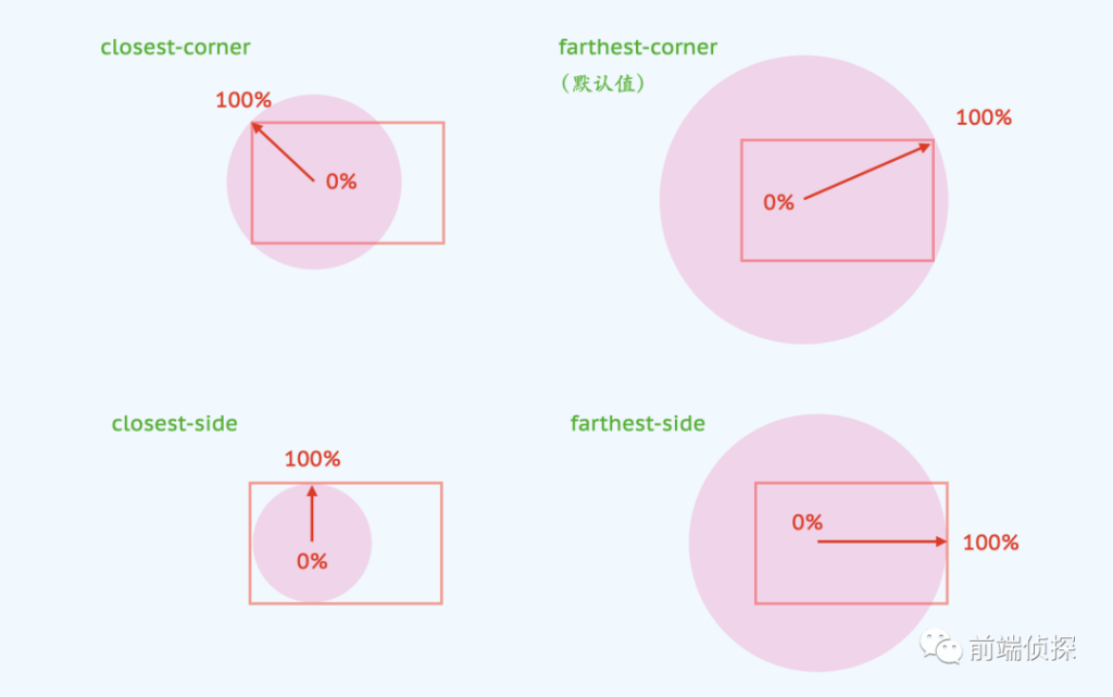
For a completely symmetrical container, closest-* and farthest-* are exactly the same.
conic-gradient
Next, we proceed to depict the surrounding sector. Essentially, it consists of several rectangular shapes at different rotational angles. In the past, such rectangles could only be achieved using DOM elements and CSS transform. However, nowadays, this effect can be achieved using conic-gradient.
The priority order of background-image is as follows: the foreground layer takes precedence over the background layer.
background-image: bg1, bg2, ...The following section involves the creation of the green portion, which is essentially a conical gradient with a starting angle of 120 degrees and a rotation angle of 90 degrees.

Another issue is that the rotation center is not located at the exact center of the figure, but rather at a point on the circle that divides it into three equal parts. If we know the position of the center point and the angle of deviation, can we calculate the position of the rotation center?

The radius of the inner circle can be represented using a CSS variable.
chrome{
--size: 45%;
background:
background: radial-gradient( closest-side circle, #477EE6 calc(100% - 10px), #fff calc(100% - 9.5px) 100%, transparent calc(100% + .5px)) center/var(--size) no-repeat,
/* green */
conic-gradient(from 210deg at calc( 50% + calc(var(--size) / 2) * cos(30deg) ) calc( 50% + calc(var(--size) / 2) * sin(30deg) ), #539E55 100deg, transparent 0)
#F2C146
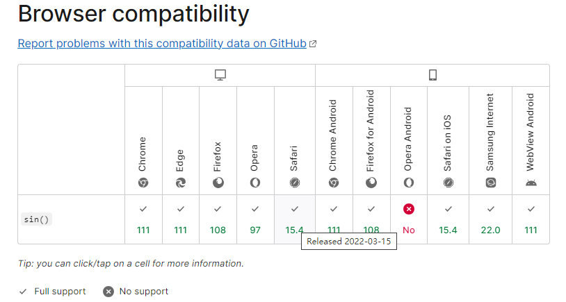
}Please note that Chrome version 111 and above now provide support for mathematical functions such as sine and cosine.
https://developer.mozilla.org/en-US/docs/Web/CSS/sin
Certainly, taking into account compatibility issues, it is also possible to specify the values numerically. For instance, cos(30 degrees) is approximately equal to 0.866 and sin(30 degrees) is equal to 0.5. Therefore, the code can be modified as follows.
chrome{
  background:
    background: radial-gradient( closest-side circle, #477EE6 calc(100% - 10px), #fff calc(100% - 9.5px) 100%, transparent calc(100% + .5px)) center/var(--size) no-repeat,
    /* green */
    conic-gradient(from 210deg at calc( 50% + calc(var(--size) / 2) * 0.866) ) calc( 50% + calc(var(--size) / 2) * 0.5 ), #539E55 100deg, transparent 0)
    /* orange */
    #F2C146
}
The results are as follows:

The red portion can be depicted in a similar manner.
chrome{
  background:
    background: radial-gradient( closest-side circle, #477EE6 calc(100% - 10px), #fff calc(100% - 9.5px) 100%, transparent calc(100% + .5px)) center/var(--size) no-repeat,
    /* red */
    conic-gradient(from 330deg at calc( 50% - calc(var(--size) / 2) * 0.866 ) calc( 50% + calc(var(--size) / 2) * .5 ), #D75442 100deg, transparent 0),
    /* green */
    conic-gradient(from 210deg at calc( 50% + calc(var(--size) / 2) * 0.866) ) calc( 50% + calc(var(--size) / 2) * 0.5 ), #539E55 100deg, transparent 0)
    /* orange */
    #F2C146
}
Doesn’t it look a bit similar? Actually, there is a bit more red in the highlighted portion, which needs to be covered with orange. That’s essentially how it is.

chrome{
  background:
    background: radial-gradient( closest-side circle, #477EE6 calc(100% - 10px), #fff calc(100% - 9.5px) 100%, transparent calc(100% + .5px)) center/var(--size) no-repeat,
    /* orange cover */
    conic-gradient( #F2C146 90deg, transparent 0) 50% 50%/ 100% var(--size) no-repeat,
    /* red */
    conic-gradient(from 330deg at calc( 50% - calc(var(--size) / 2) * 0.866 ) calc( 50% + calc(var(--size) / 2) * .5 ), #D75442 100deg, transparent 0),
    /* green */
    conic-gradient(from 210deg at calc( 50% + calc(var(--size) / 2) * 0.866) ) calc( 50% + calc(var(--size) / 2) * 0.5 ), #539E55 100deg, transparent 0)
    /* orange layer */
    #F2C146
}
Finally, the rounded corners can be set. The following is the complete code.
chrome {
  width: 200px;
  height: 200px;
  border-radius: 50%;
  --size: 45%;
  background: radial-gradient( closest-side circle, #477EE6 calc(100% - 10px), #fff calc(100% - 9.5px) 100%, transparent calc(100% + .5px)) center/var(--size) no-repeat,
    conic-gradient( #F2C146 90deg, transparent 0) 50% 50%/ 100% var(--size) no-repeat,
    conic-gradient(from 330deg at calc( 50% - calc(var(--size) / 2) * 0.866 ) calc( 50% + calc(var(--size) / 2) * .5 ), #D75442 100deg, transparent 0),
    conic-gradient(from 210deg at calc( 50% + calc(var(--size) / 2) * 0.866 ) calc( 50% + calc(var(--size) / 2) * .5 ), #539E55 100deg, transparent 0),
    #F2C146
}
Conclusion
1. Complex shapes can be transformed into familiar forms by breaking them down.
2. The “closest-side” property in radial gradients allows for direct control of the size of a circle based on the background size.
3. In cases of multiple backgrounds, the layering of the foreground background takes precedence over the background behind it.
4. Previously, rotating rectangles could only be achieved through CSS transforms, but now it is possible to utilize conic gradients.
5. CSS trigonometric functions provide a convenient way to calculate the relationship between angles and positions.