Best React Guided Tour Libraries for User Onboarding
When a new version of a product is released or new features are launched, it is often necessary to provide new user guidance to help users understand the application. In the following, we will share the best react guided tour libraries for user onboarding, which can assist in quickly implementing new user guidance functionality.
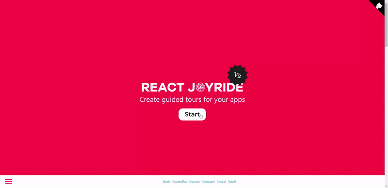
React Joyride
Showcase your app to new users or explain functionality of new features.
View the demo here (or the codesandbox examples). Read the docs.
It uses react-floater for positioning and styling. And you can use your own components too!
In React projects, this tool is readily available for introducing new features to existing users. It possesses the following characteristics:
1. User-friendly
2. Highly customizable
3. Comprehensive documentation
4. Actively maintained
Install
npm i react-joyrideUsage
import Joyride from 'react-joyride';

export class App extends React.Component {
  state = {
    steps: [
      {
        target: '.my-first-step',
        content: 'This is my awesome feature!',
      },
      {
        target: '.my-other-step',
        content: 'This another awesome feature!',
      },
      ...
    ]
  };

  render () {
    const { steps } = this.state;

    return (
      <div className="app">
        <Joyride
          steps={steps}
          ...
        />
        ...
      </div>
    );
  }
}
If you need to support legacy browsers you need to include the scrollingelement polyfill.
Reactour
Tourist Guide and a set of Assistants to travel into your React Components.
Reactour is a popular library used for creating guided tours of React applications. It offers a straightforward approach to guiding users through websites and applications.
Examples
- Using React Router
- Using React Router with automatic route switching
- Using React Modal
- Using Semantic UI Modal
- Using React Bootstrap Modal
- Tour with data fetching
Install
npm i -S @reactour/tour
# or
yarn add @reactour/tour
Usage
Add the TourProvider at the root of your Application, passing the steps of the elements to highlight during the Tour.
// ...
import { TourProvider } from '@reactour/tour'

ReactDOM.render(
  <TourProvider steps={steps}>
    <App />
  </TourProvider>,
  document.getElementById('root')
)

const steps = [
  {
    selector: '.first-step',
    content: 'This is my first Step',
  },
  // ...
]
Then somewhere down the Application tree, control the Tour using useTour hook.
import { useTour } from '@reactour/tour'
function App() {
const { setIsOpen } = useTour()
return (
<>
<p className="first-step">
Lorem ipsum dolor sit amet, consectetur adipiscing elit. Praesent at
finibus nulla, quis varius justo. Vestibulum lorem lorem, viverra porta
metus nec, porta luctus orci
</p>
<button onClick={() => setIsOpen(true)}>Open Tour</button>
</>
)
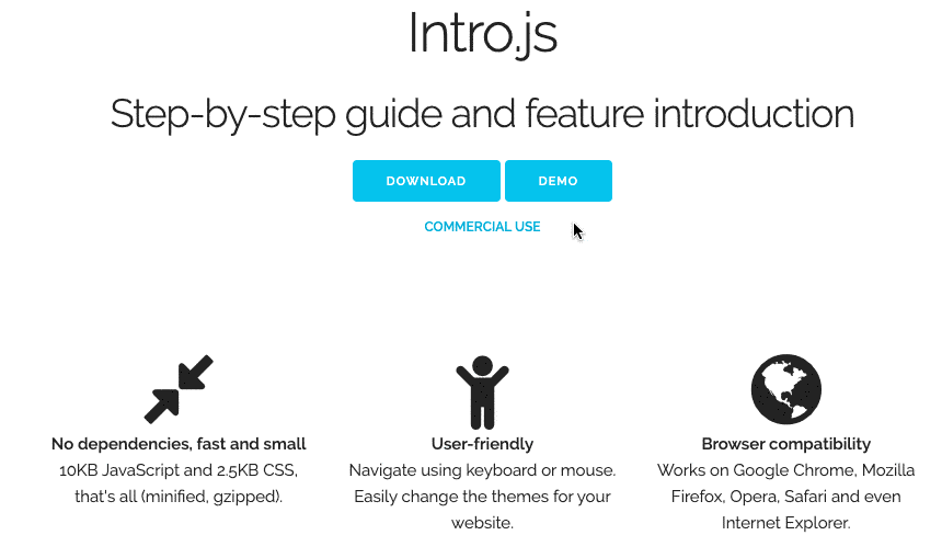
}Intro.js
User Onboarding and Product Walkthrough Library.
View the demo here. Read the docs.
Characteristics of this library include the following:
1. Independence: It does not require any other dependencies.
2. Lightweight and fast: The library files are small, resulting in a smooth and intuitive bootstrapping process. The overall size of the JavaScript file is 10KB, and the CSS file is 2.5KB.
3. User-friendly: It offers a variety of themes that can be chosen according to preferences.
4. Browser compatibility: It is compatible with all major browsers, such as Google Chrome, Mozilla Firefox, Opera, and Safari.
5. Comprehensive documentation: The documentation includes samples and examples for each element to be introduced.
How to use
Intro.js can be added to your site in three simple steps:
1. Include intro.js and introjs.css (or the minified version for production) in your page. Use introjs-rtl.min.css for Right-to-Left language support.
CDN hosted files are available at jsDelivr (click Show More) & cdnjs.
2. Add data-intro and data-step to your HTML elements. To add hints you should use data-hint attribute. For example:
<a href='http://google.com/' data-intro='Hello step one!'></a>See all attributes here.
3. Call this JavaScript function:introJs().start();
Optionally, pass one parameter to introJs function to limit the presentation section.
For example introJs(".introduction-farm").start(); runs the introduction only for elements with class='introduction-farm'.
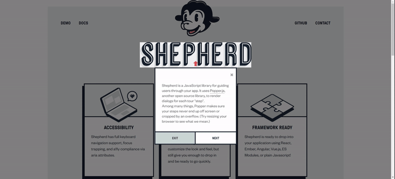
Shepherd
Guide your users through a tour of your app.
View the demo here. Read the docs.
It supports out-of-the-box functionality in multiple front-end frameworks such as React, Vue, and Angular. It emphasizes the following characteristics:
1. Accessibility: The tool provides keyboard navigation support, adheres to a11y standards, and enables focus capture within DOM elements using JavaScript.
2. High customizability: It allows for changes in appearance without compromising performance.
3. Framework compatibility: The tool seamlessly integrates into front-end framework projects.
4. Comprehensive documentation: The documentation covers installation and customization, including themes and styles for the project.
Install
npm install shepherd.js -save
npm install react-shepherd --save
npm install vue-shepherd --save
npm install angular-shepherd --save
Usage
import React, { Component, useContext } from 'react'
import { ShepherdTour, ShepherdTourContext } from 'react-shepherd'
import newSteps from './steps'

const tourOptions = {
  defaultStepOptions: {
    cancelIcon: {
      enabled: true
    }
  },
  useModalOverlay: true
};

function Button() {
  const tour = useContext(ShepherdTourContext);

  return (
    <button className="button dark" onClick={tour.start}>
      Start Tour
    </button>
  );
}

class App extends Component {
  render() {
    return (
      <div>
        <ShepherdTour steps={newSteps} tourOptions={tourOptions}>
          <Button />
        </ShepherdTour>
      </div>
    );
  }
}